Read More
Pantone Colour of the Year 2023: Interior Design Inspiration
Who is Pantone?
The Pantone Colour Institute is a consulting service within Pantone’s colour brand, that forecasts global colour trends and advises companies on colour in brand identity and product development. Recognised around the world as the leading authority on colour information through seasonal trend forecasts, custom colour development and palette recommendation. Pantones Colour of the Year has become a widely anticipated release in all areas of design.
Pantone have chosen a powerful and vibrant red shade as their Colour of the Year 2023, Viva Magenta! This colour is already trending in the fashion and beauty world and is now spilling into interior design. Here we will give you some tips and tricks on how to add this exciting tone to your living space.
Behind Viva Magenta
In the age of technology, we look to our homes as a place of calm and refuge. Drawing inspiration from nature can be a great way to ground your space. Pantone’s magenta is inspired by the red of cochineal, one of the most precious and vibrant nature dyes in the world. Viva Magenta was chosen to reflect our pull towards natural colours and the movement surrounding climate change and sustainability.
Adding Viva Magenta to Your Home
As Viva Magenta is a bold colour, we would opt for using it as a statement or accent piece to avoid your space becoming overpowered.
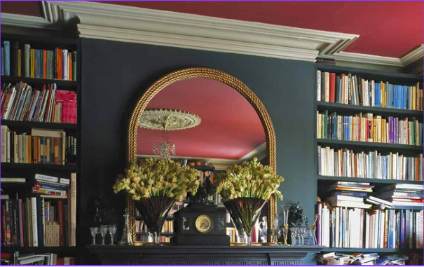
The living room or bedrooms seem like the most obvious choice to start with when adding a colour like Viva Magenta, its warm and soothing tone offers serenity to a space while still lending a unique design aspect.
One way to add colour that people often forget is by painting the ceiling of a room. This can add a real element of interest and a depth to your design concept.
Perhaps the easiest and lowest commitment way of adding colour to your space is through the use of soft furnishings. A magenta sofa, throw pillows or even a blanket strewn across your favourite armchair can add interest and vibrancy.
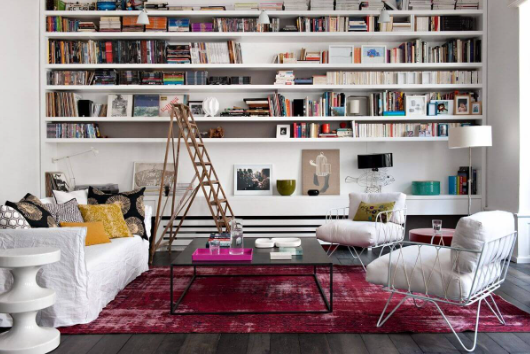
A large rug in a contrasting tone can really pull a room together.
While it may seem more difficult to add such a vibrant colour to your kitchen space, there are a few ways this tone without it being overpowering.
Combining the magenta with earthy muted tones lowers the contrast, it still makes an impact but it doesn’t take over the space.
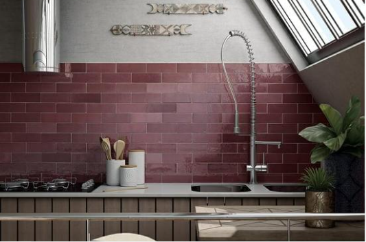
The magenta backsplash is complimented by the earthy neutral tones of the natural finish wooden cabinets. Combined with lots of greenery and cool toned metals to provide contrast.
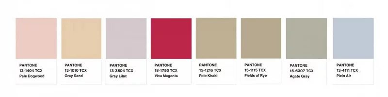
Viva Magenta Colour Palette
While colour combination is largely a personal choice and the right shades of any colours can work together, Pantone have released a colour palette that perfectly compliment the vibrant Viva Magenta.
With these tips and tricks at your disposal, we hope to see some bright and vibrant homes in 2023. Embrace colour, Viva Magenta!